Designing a brand for a brand-new event: An Interview with Alchemy Digital
I chat to Alchemy Digital Managing Partner, creative genius, and friend of the charity Will Morris about the creation of the Race for Science website.
See this beautiful website you’re currently looking at? Someone needed to design that from scratch. When we first met with Alchemy Digital – our wonderful website designers and builders – we had decided on very few details for Race for Science. In fact, it was my second-ever day of work, and I knew almost nothing about the event! I asked Will Morris from Alchemy to explain how his team developed the website and brand guidelines, and why he’s excited about Race for Science.
Jess: Talk me through designing the brand guidelines and website wireframes for Race for Science.
Will: When creating the Race for Science website, there were two main challenges we needed to address. Firstly, we needed to make this event seem exciting and fun.
This event is about capital S-Science, which can be quite a serious affair. We realised was that the brand needed to have a little bit of silliness to counteract the serious science. The event is supposed to be fun and entertaining – you’re not doing boring graphs at work!
We wanted to create some level of immersion, and connection to the activities you’d be doing on the day. In other words, we wanted the website to be “in-universe”.
The second big challenge was that Race for Science has never happened before, and when we met back in December 2017, very few specific details had been decided for the event. We didn’t want to give anything away that hadn’t been decided, and crucially we had no photography we could use to show people what the event was like and how fun it was going to be. This could have made things quite difficult, but we realised we could use it to our advantage. A rough idea started to form: a scientific conspiracy wrapped up in secrecy.
That realisation opened up a few gateways for us. It meant that we didn’t have to have photography. You should almost feel like you shouldn’t be reading this document – maybe it’s a classified fax from the government (remember faxes? Remember the government?!?!)
That led to us using the facsimile/typewriter, anatomical diagrams and blueprints throughout the website.
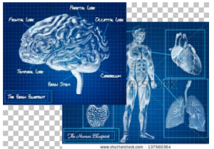
Some Shutterstock anatomical diagrams
Of course, we had to balance that sense of mystery against the need to communicate what the event actually is and how to book tickets. We decided to give up a little bit of user experience for the sake of the brand by having the typewriting bit of text at the top of the homepage, before they scroll to the menus.
We wanted to target early adopters; it’s a brand new event, and we wanted people who aren’t afraid of trying new things leading the way like to step into the unknown. So the suggested copy emphasized how new and unprecedented Race for Science is.
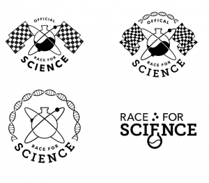
Some early Race for Science logo concepts
The wonderful logo we ended up with!
Jess: Talk us through the process of developing a new website generally.
Will: All of our projects always start with strategy. We work with a lot of small, online-only businesses, and so the business strategy is often entirely online. This makes our job extremely important for the overall success of the business.
Digital strategy means really understanding the objectives of the organisation. What do you want the website to do for your business (or in your case, your charity)?
Jess: That was really tricky with us at Prostate Cancer Research Centre because no one really knew!
Will: Exactly! The next step is who is your audience (getting very specific), and what are their objectives? We are pushy about nailing exactly who your audience is and then we cater specifically to that audience.
We also need to know what the website needs to do over the course of a year, and how the content will change over time.
Normally we would do wireframes, blue to remind people of architectural blueprints, no branding, pure user experience.
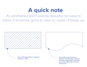
Image from the PCRC website wireframes
Because you guys were working with a limited budget, we decided to take a big risk: we skipped the wireframes step and created a fully branded website for you guys.
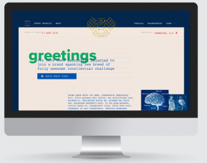
The original text that Alchemy suggested for the website! It reads: “you have been personally selected to join a brand spanking new breed of fully awesome intellectual challenge.” 😛
Jess: Why did you want to work with us on this? Why were you excited about Race for Science?
Will: Three reasons.
1) We love a design challenge. Designing things that are easy is no fun. This was definitely not easy!
2) Also, there isn’t anything like this. It’s rare to find something genuinely new. It had a very unusual brand story, we had very little information to work with, and no photography to work with as I already mentioned.
3) We love the internet. We all fell in love with it 20 years ago. BUT, there are lots of ways to abuse and take advantage of the internet, and we don’t often get the chance to do good online. And in this instance, we wanted to contribute to a cause that we all felt passionate about. We got the opportunity to generate buzz and enthusiasm for something that might save somebody’s life. That was very exciting to us.
Jess: The process worked out so well, that you ended up designing our brand new website! Do you want to say anything about the process of working on the main charity website?
Will: After working with you on Race for Science, we really wanted to work with you guys on the main site. We knew you were all good bastards, you guys had strong opinions, and sometimes you guys were wrong about things but you were always willing to listen.
You can check out the beautiful new PCRC website here, and go have a look at Alchemy Digital!